
Prioritizing Email
UX/UI Design

Overview
Working with a representative from Google as a mentor to attempt a real design challenge that they have been working on.
Scope
A five week group project with the goal of designing a mobile email app that makes it easy for people to stay on top of important communication in their lives.
Role
Researcher
Interviewer
UX Designer
Figma
Date
Aug - Sep 2024
Client
Tools
Background

I worked with two other group members to try to tackle the question “How can we design an email application so that users can stay on top of important communication in their life?”
Design Brief
We were given a design brief by Shankar, an interaction designer at Gmail. The brief included the opportunity, the task at hand, and some considerations.
The Opportunity
Email inboxes are overflowing with emails. People get a mix of emails, ranging from objectively bad junk to critically important communication.
The Task
Design a generic email app that helps people stay on top of important things without making them do all the work of setting up their inbox correctly.
Considerations
The brief listed several considerations and the following are ones that we chose to focus on:
What’s the difference between a task (or “to do”) and a piece of information you don’t want to forget? You might think tasks fall into one of four quadrants according to importance and urgency.
Crises - Urgent and Important
Goals and Planning - Not Urgent and Important
Interruptions - Urgent and Not Important
Distractions - Not Urgent and Not Important
Scale
Email apps have billions of users. Designing something at scale means designing with a variety of users in mind.
Some tidbits of my thoughts
Note that none of this project is officially Google’s property.
A challenge is that everyone uses email differently, receives varying types of emails, and has different definitions of what is urgent or important.
Problem
People’s inboxes are overflowing with huge quantities of emails, ranging from emails that are critically important to things that are objectively junk. Email has become a chore - how can it be simpler? The problem is that every user has a different definition of what is important to them.
Research
Primary Research

Interviews
We interviewed a few different users groups, focusing mainly on young, working professionals. We aimed not only to understand different ways in which current features are used, but the barriers to becoming a successful email user.
Key Insights
Interviewees reported heavy email use in their professional setting while spending significantly less time (15-20 minutes/day) on email outside of work. A common time to use email outside of work was during their commute home.
Some users reported that they are not very good at organizing their personal emails but they are open to the idea.
Users are frustrated with the difficulty of moving emails into folders.
After identifying the problem, we decided to narrow our focus to designing for a single user, hoping that if the solution works for that user it can work for many others.
I was on the interview team and had the privilege of coming up with interview questions on behalf of my team for an interview with Shankar.


Clarifying the Problem
Users who are overwhelmed don’t spend much time on their email and find it cumbersome to organize by moving emails into folders.
How can we provide the tools for organization to motivate users while reducing the time spent?
Make email time efficient and natural.
The overall goal is to make the process of viewing and sorting emails faster and more intuitive, thereby making the most of the user’s time investment.
Objective
What is the Problem?
Context

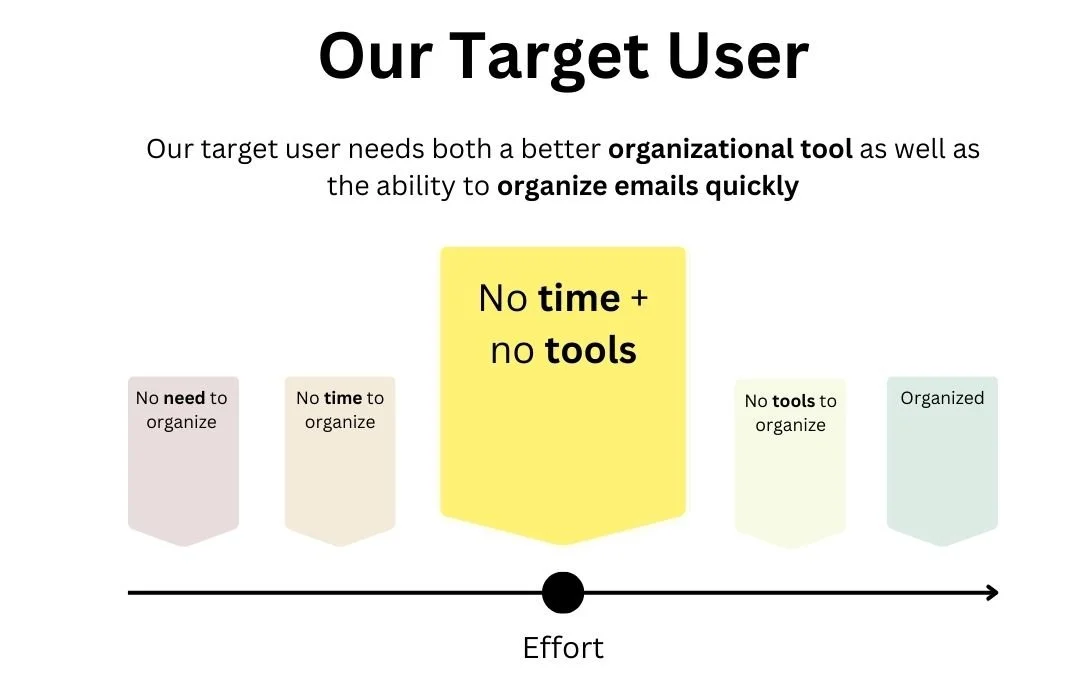
We chose to focus on those who don’t have the time or tools but want to be more effective with keeping their emails organized.
Solution


Scenario 1
After heading to an art fair to sell some pieces, Owen takes the subway home. On his commute, he opens his phone to quickly swipe through some emails...

1

2

3

4
5

6

7

By using his short amount of downtime efficiently, Owen was able to broadly organize his inbox and go through all of his unread emails without having to set aside time in his day. Having no unread emails leaves him with a stronger sense of satisfaction.

Scenario 2
The next day, Owen arrives at his studio and utilizes the priority views in his inbox to easily check what he needs to attend to...
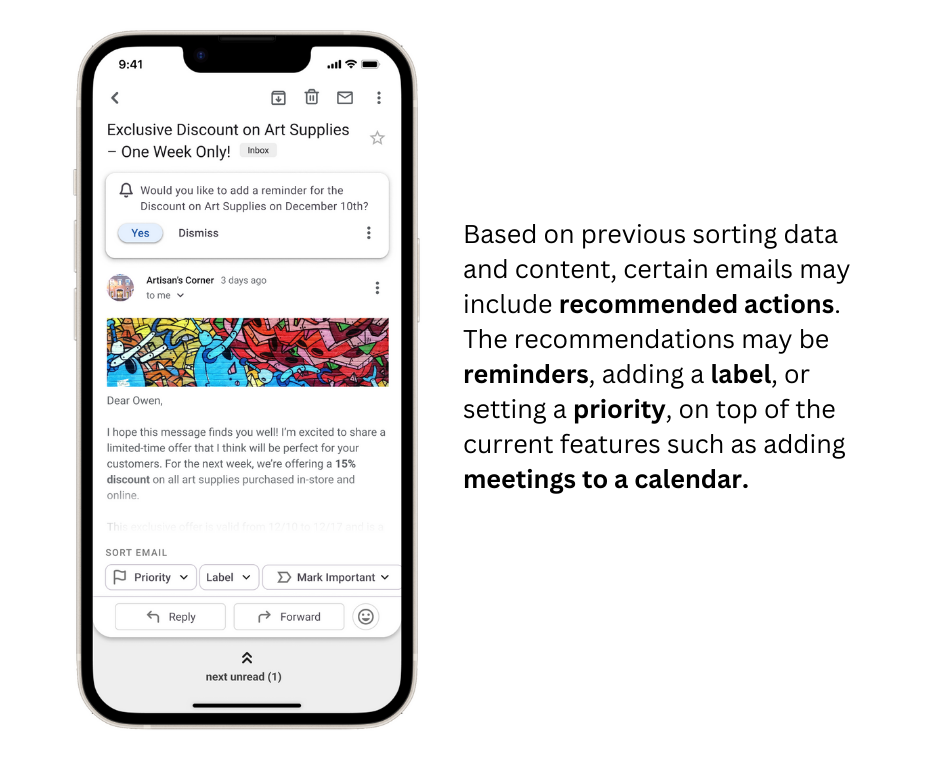
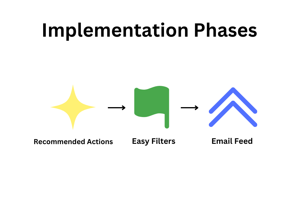
Owen can use a combination of the Email Feed, Easy Filters, and Recommended Actions features to help sort his unread emails.


Since Owen was able to stay on top of his emails during his downtime, he is able to take full advantage of the integrated sorting tools to rapidly get an idea of his day-to-day tasks.
Owen uses the priority views to see the emails he wants to address based on what he marked as high, medium, or low priority.
Final Prototype
Measuring Success
Current email features such as labels can be easily accessed from the home page, making them even easier to see and use.
Overall, the number of clicks required to sort through has been reduced, whether with custom labels or flags. For example, applying a filter to an email previously took four clicks, whereas the same action in their new position only takes two. Further, we achieve more consistency of related actions between the inbox and preview screens.
Future Considerations
We intended in our design to respect current facets of the G-mail layout, so as to make it easily implemented as well as easily adjusted to by new users. The inbox sorting features follow the currently existing template used in the search bar. The quick label menu is also redundant to the old menu structure which remains under the three-dot drop down menu. The recommended action places itself familiarly to already existing alerts.
The moment that Owen found the time and inclination to look at his email was used to its fullest. Owen’s satisfaction was increased not just with email itself, but also feeling less personally overwhelmed.
Even with the benefit to workflow added by these features, they are generally not intrusive to the current G-mail workflow. They are also easily able to be toggle-able or customizable by users.
Results
My group presented our design solution and it was then sent to a representative at Google. We received feedback that we synthesized our target user well and that there was a good mix of visual storytelling woven into our solution. However, something that could be improved upon is fleshing out how we explained our solution. Google gave us a complex design challenge and I enjoyed the process of taking research and coming up with a digital design solution.
Being given a design brief from Google was a complex yet rewarding first experience with UX design.